Case study · Brand, 2021 to 2026

Building a brand
nobody had
heard of.

I was the founding creative hire at Prezent. There was no logo, no palette, no voice, no system, and no design team. What follows is what got built, and what it made possible.

Role · Founding creative hire → Director, Design & Brand
Span · Mar 2021 – Jul 2026
Category · Enterprise AI
Scroll

Nothing existed.

Not an identity, not a template, not a rule about how anything should look. A Series A company selling AI to Fortune 500 communications teams, with nothing to look at.

The brief I set myself was uncomfortable and simple: how do you build trust for a brand nobody has heard of, in a category nobody trusts yet?

In 2021 "AI" in enterprise software still read as either vapour or threat. Looking futuristic was the obvious move and the wrong one. Looking futuristic is what you do when you have nothing to prove with. The job was to look inevitable instead: calm, specific, and already in the room.

Phase one · 2021

The first mark, and the first rule.

The earliest identity had to do two jobs at once: exist, and be usable by people who were not designers. Everything that followed was judged against whether a salesperson in Basel could apply it correctly at 11pm without asking me.

So the first real artefact was not a logo. It was a template. The logo came with a system attached or it did not ship.

The original prezent.ai wordmark
Original wordmark · 2021
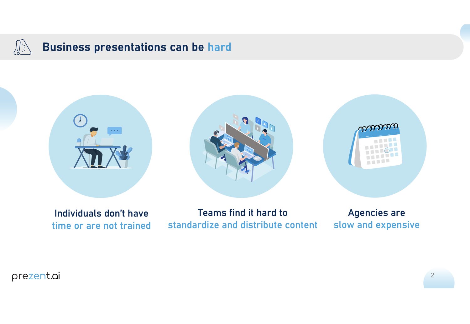
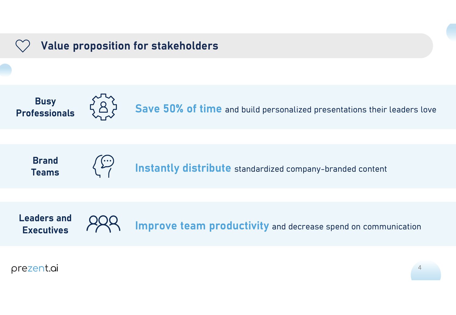
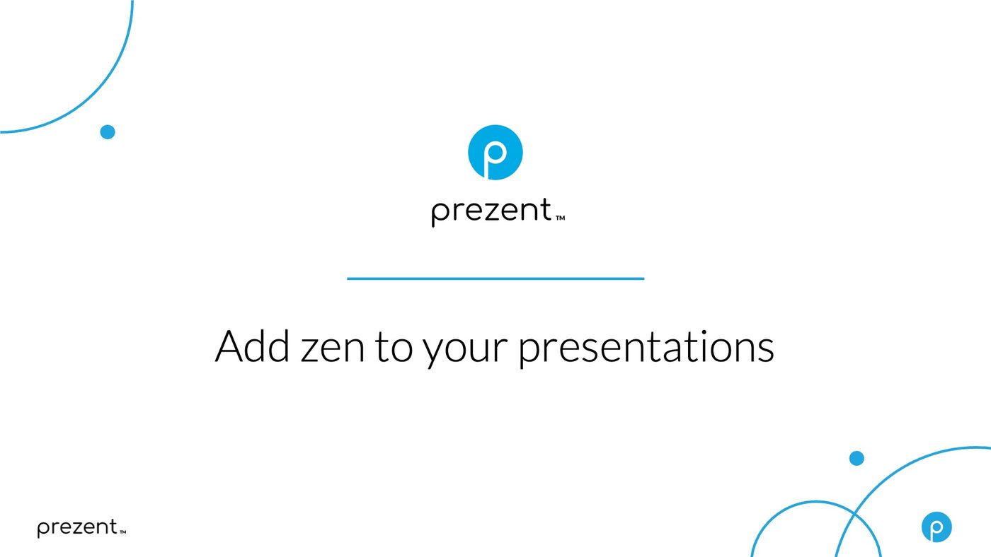
The 2021 presentation template
Early company overview deck
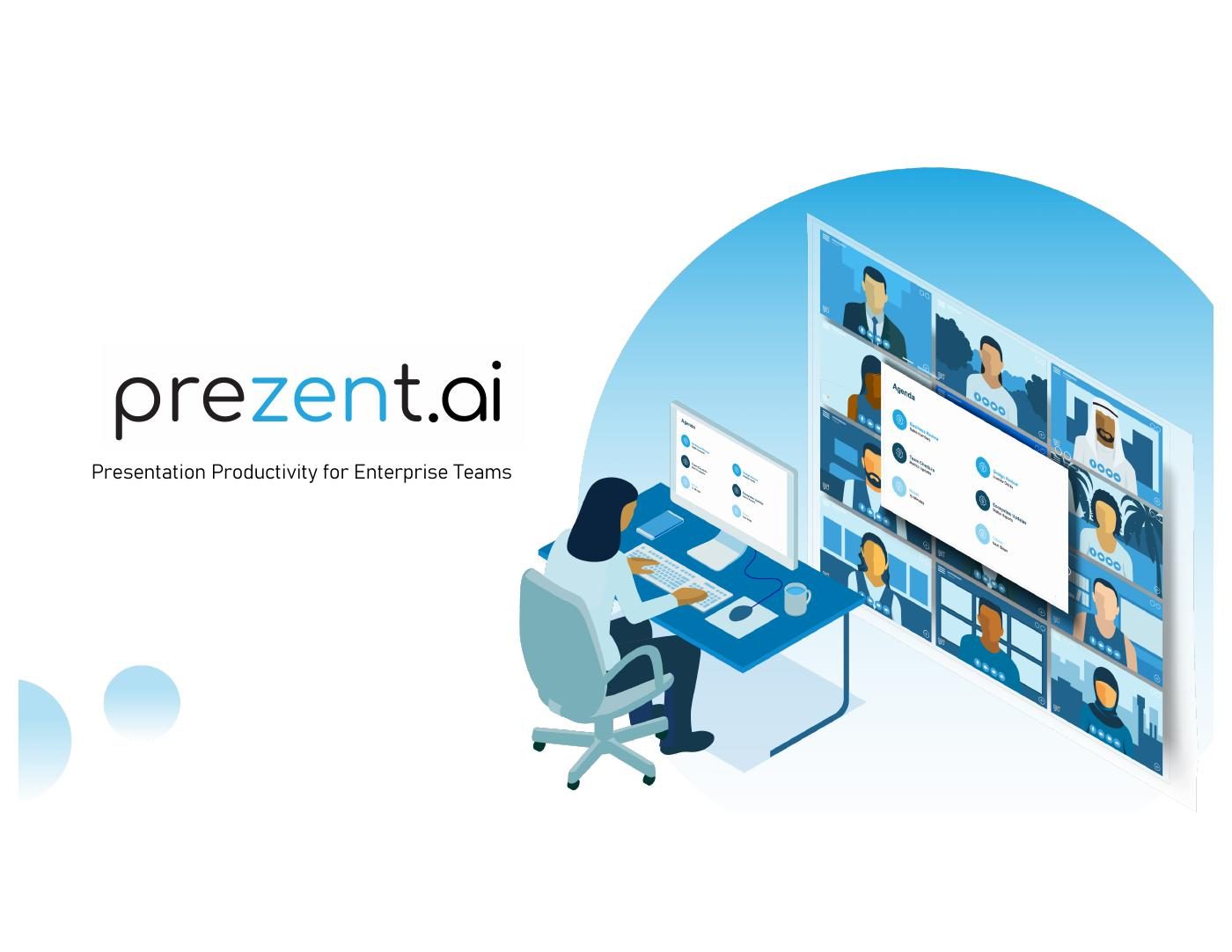
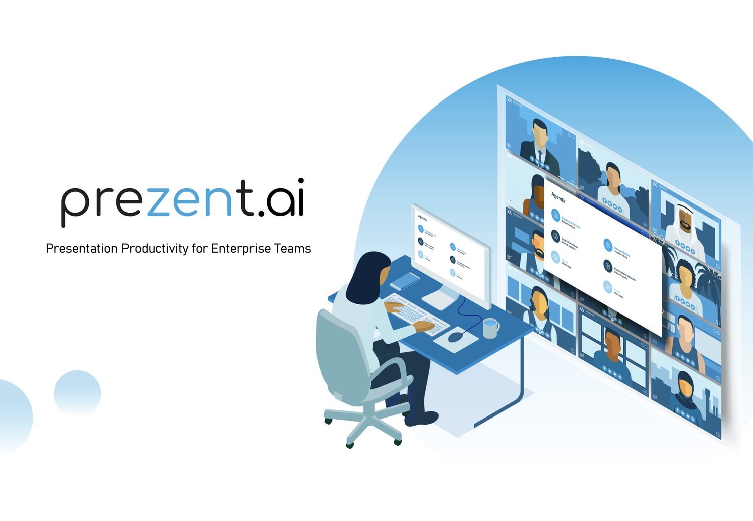
Early brand imagery
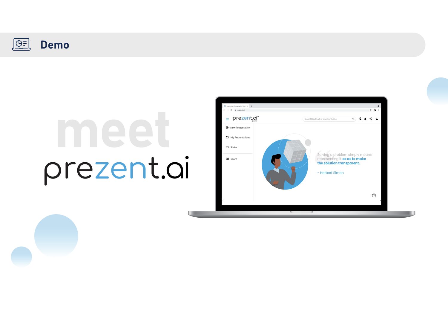
Early product state
Early product state
Early product state
Early product state
Early brand imagery
The original state · first template, first overview deck, first product screens

The first film.

Before there was a category to explain, there was a product nobody could picture. The first brand film existed to answer one question for a buyer who had never heard the company's name: what is this, and why would I care.

It set the register everything since has had to match. Calm, plain, human. No swooshing data, no robot hands.

First brand film · 2021
Phase two · 2023

A system, not a look.

By 2023 the problem had changed. The brand existed; the question was whether it could survive volume. A messaging guide went out covering principles, positioning, voice, product language, and the visual system, so that a sales deck built in Zurich and a webinar built in Bangalore came out of the same brand.

The positioning it locked: the only AI presentation platform with brand-aligned, purpose-built slides for enterprise teams. Not "AI for decks." A specific claim you could verify, which is what a sceptical buyer needs.

Our founding belief: everyone deserves a fair chance to bring their ideas to life.
Product motion · generate
Product motion · learning

Then it had to go out and earn attention.

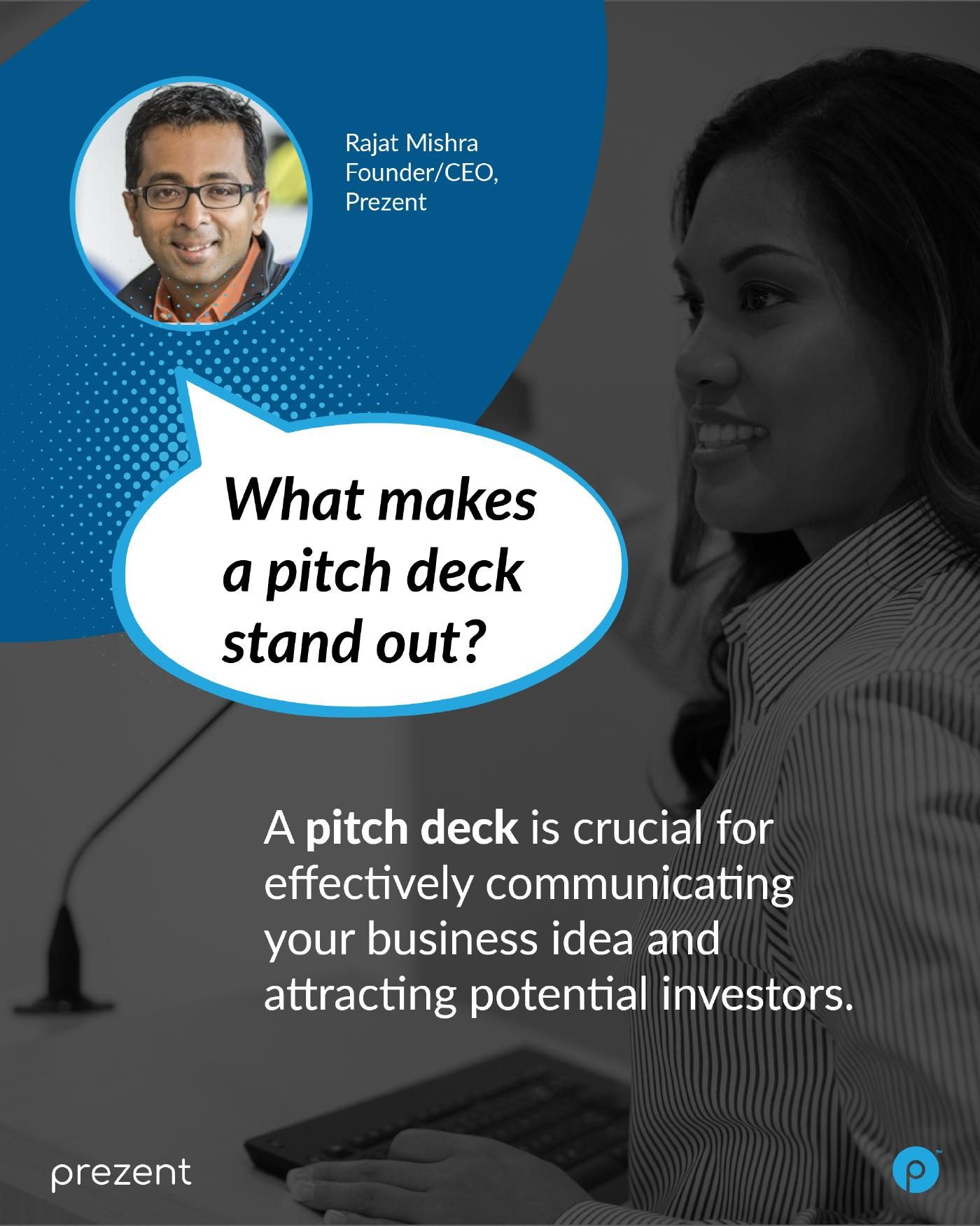
A system is theoretical until it has to produce a hundred different things in a quarter. This is the period where the brand stopped being a guide and became an output: pitch decks, sales one-pagers, flyers, long-form carousels, vertical social, thought-leadership films, persona campaigns. Different formats, different audiences, one recognisable company.

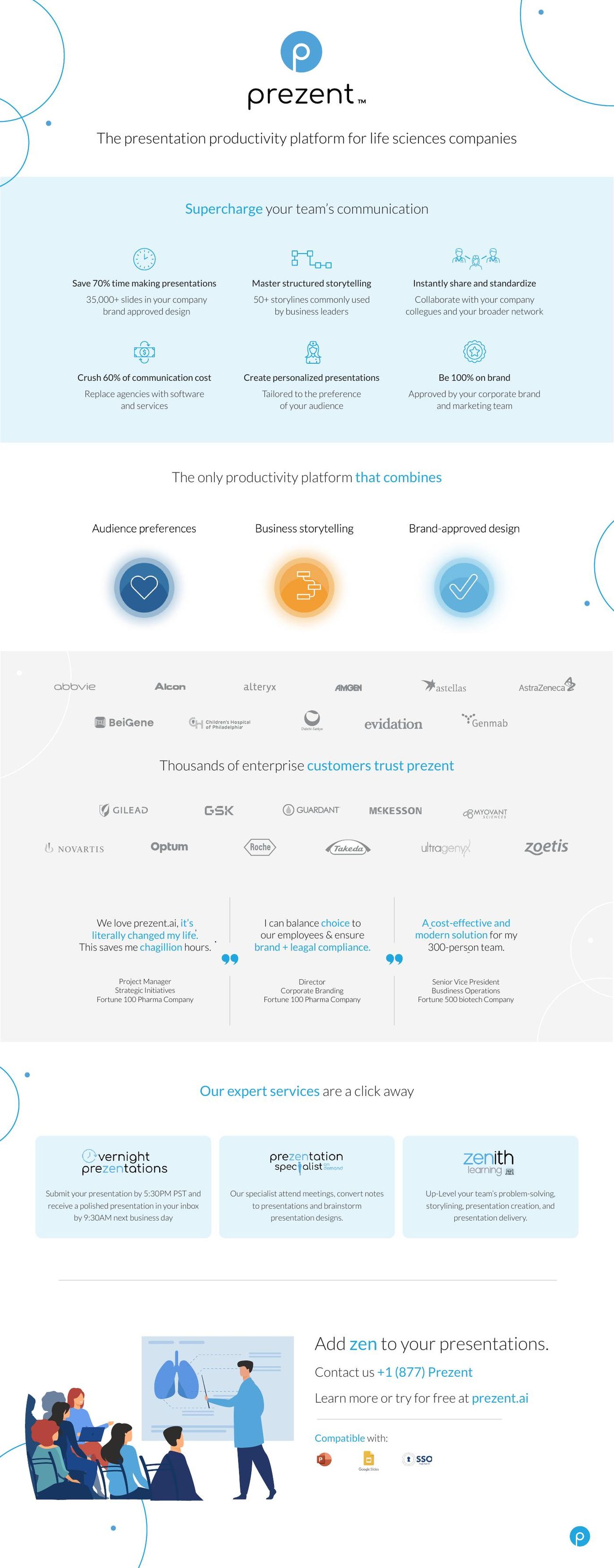
Pitch deck
Medical sales one pager
Marketing flyer
Pitch deck · medical sales one-pager · flyer
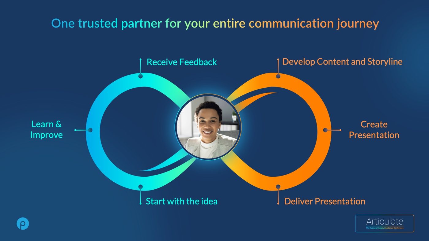
Social campaign · the communication partner
Vertical product campaign · auto-generate
The 2022 template system
Template system · 2022

The unglamorous piece carrying all of it: the template. Every deck the company sent, internal or external, came out of one file. That is what made a one-to-three day turnaround possible later, and it is the reason the brand held while the headcount tripled.

Marketing reach is a design problem before it is a media problem. If the work cannot be produced quickly and correctly, there is nothing to distribute.

Stacked prezent logo
Prezent Blue#21A7E0
Prussian Blue#183862
Tangerine#FF9143
Rainbow gradient2025 marquee
prezent lite
prezent standard
prezent pro
prezent premium
Phase three · 2025

We dropped the P.

The strength of the logo was never the graphic. It was the name. Lowercase, name-first, no tech motif, nothing to decode. Unintimidating but confident, which is exactly what the product had to be for someone who dreads building a deck.

The colours

One anchor, one voice.

Prussian Blue is the floor the brand stands on: dark, serious, enterprise. Prezent Blue is the only thing allowed to raise its voice, reserved for the action you want taken.

Tangerine appears rarely and on purpose. The rainbow gradient arrived in 2025 as the marquee, with rules tight enough to keep it rare: bold weights only, dark grounds only, never inside a shape or an icon.

The P, clarified

A signature, not a decoration.

The mark did not disappear. Its job changed. It became a stamp of authorship, used where the brand is vouching for something, and banned as ornament. A tier system carried it across the product family.

The 2025 rebrand

Design meets clarity.

A visual shift rather than a fresh coat of paint: dark grounds, outline shapes, UX icons, the rainbow gradient, and a voice with no fluff in it. The film that carried it internally.

Rebrand film · 2025
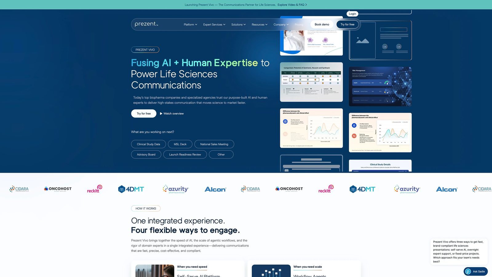
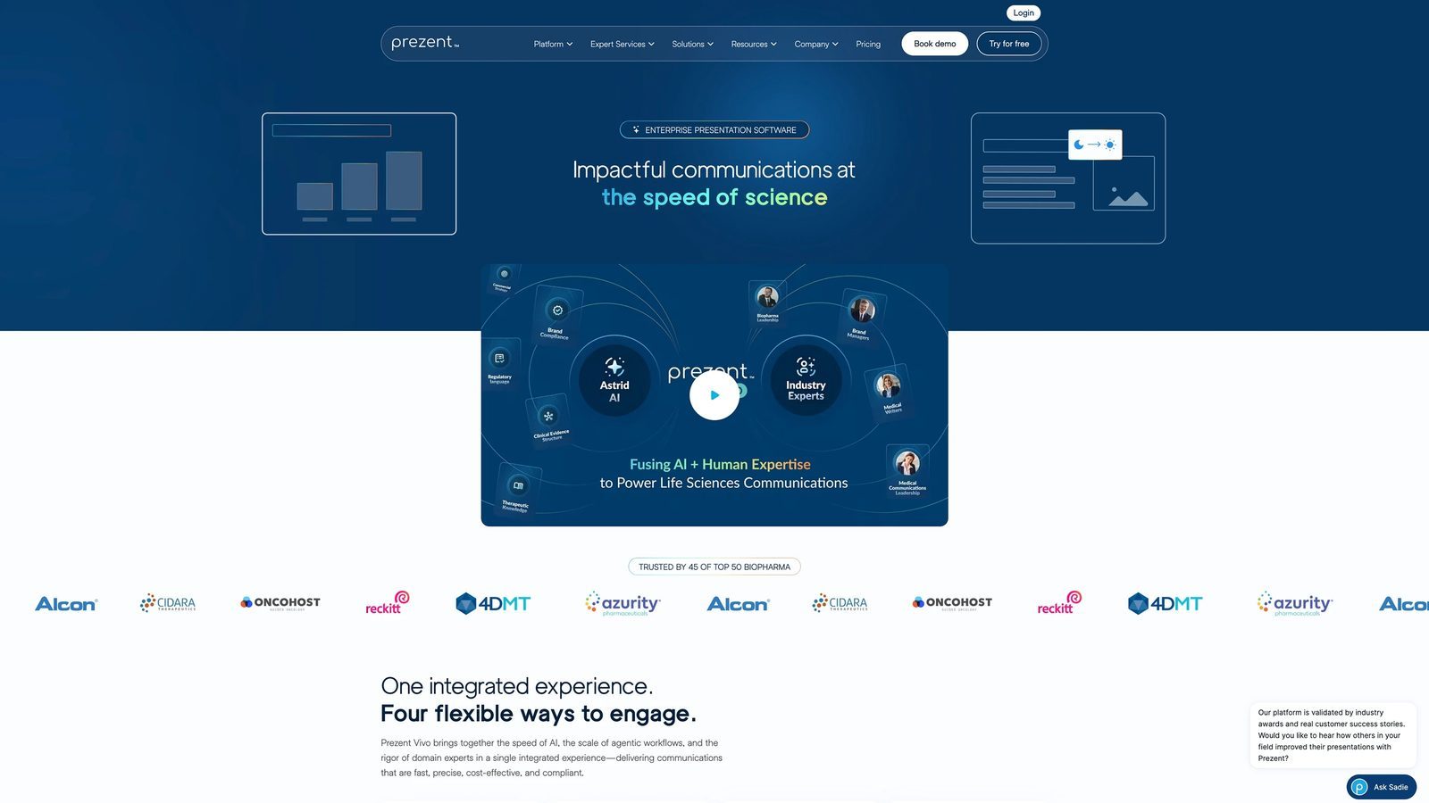
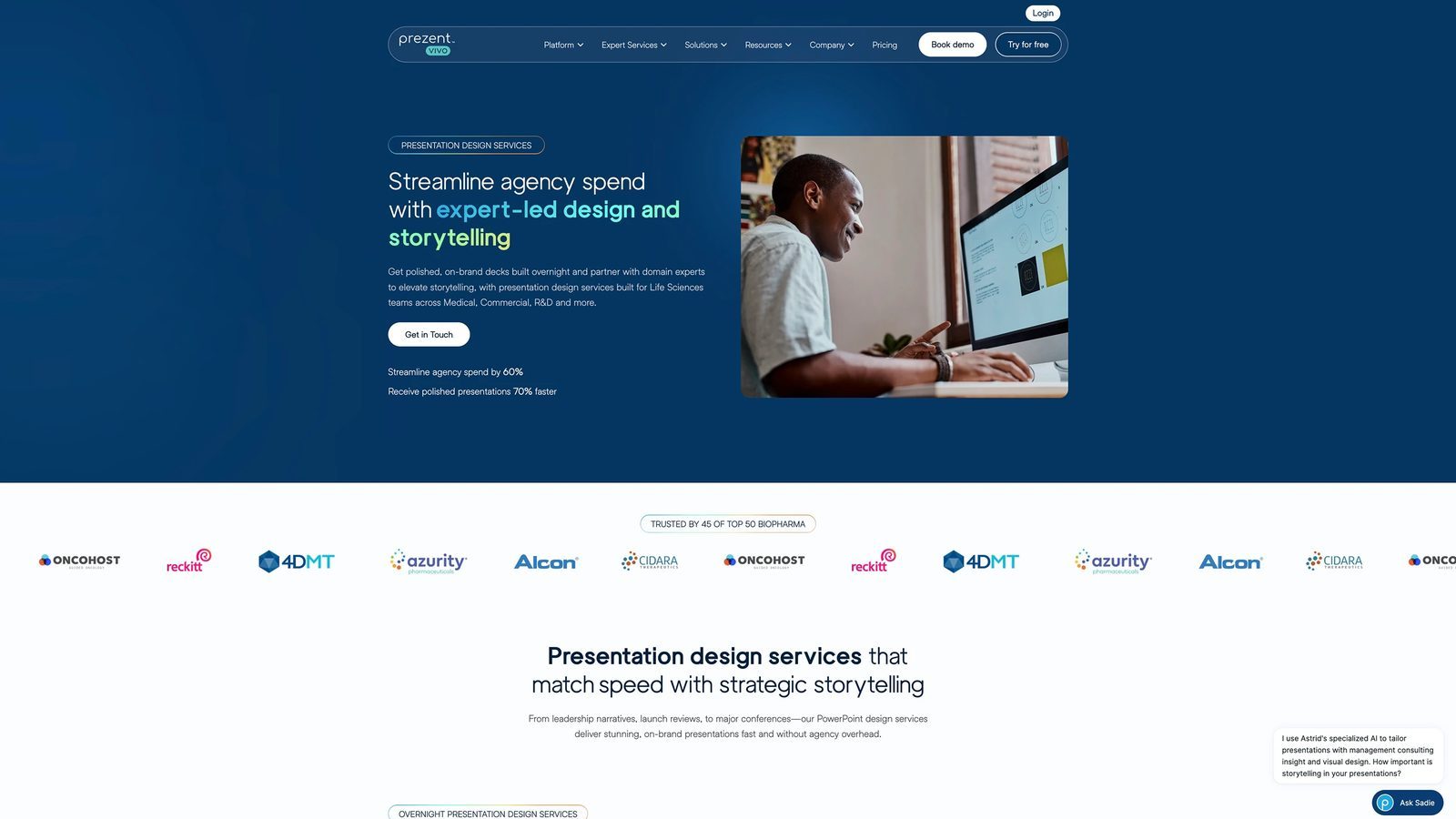
Prezent website hero
Where it all lands

The system, in public.

Every decision above is enforceable or it is decoration. The site is where you find out. Dark ground, one blue doing the asking, the gradient earning its place on exactly one line, and a claim specific enough to be checked.

By this point the brand had narrowed from "enterprise teams" to life sciences, the market where being on-brand is a regulatory matter rather than a preference.

Prezent website section
Site sections
Product surface

The brand had to survive the UI.

Marketing can be controlled. Product cannot, not once a room full of engineers is shipping into it. The motion language, icon rules and colour roles existed so that a feature built without me still came out looking like the same company.

Google Material icons, outline shapes, one blue reserved for action. Constraints boring enough that nobody needed to ask.

Storyline editor · intelligent editing
Phase three · Generative AI in production

Then I automated my own team's worst week.

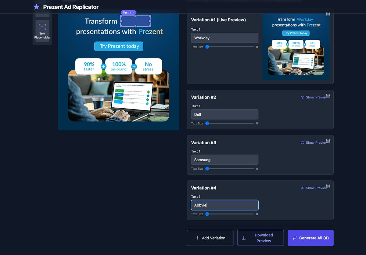
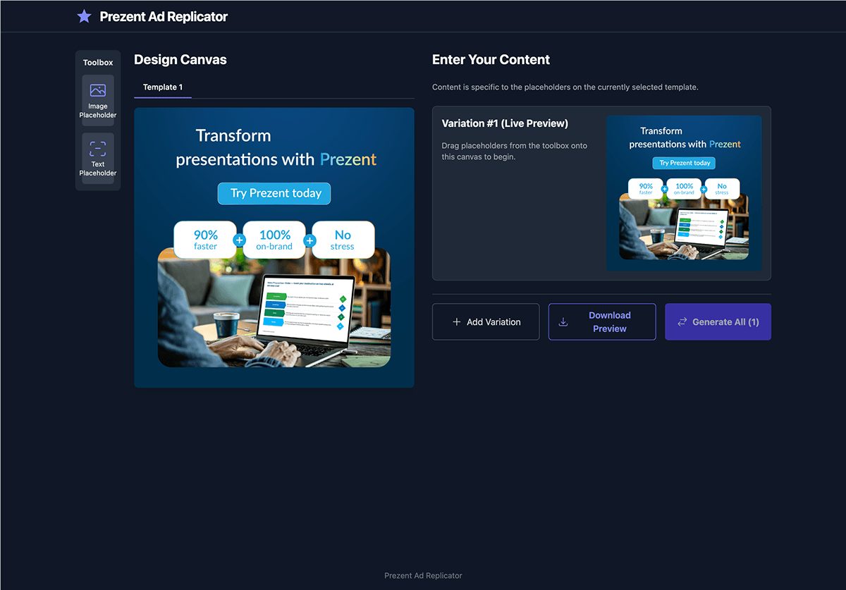
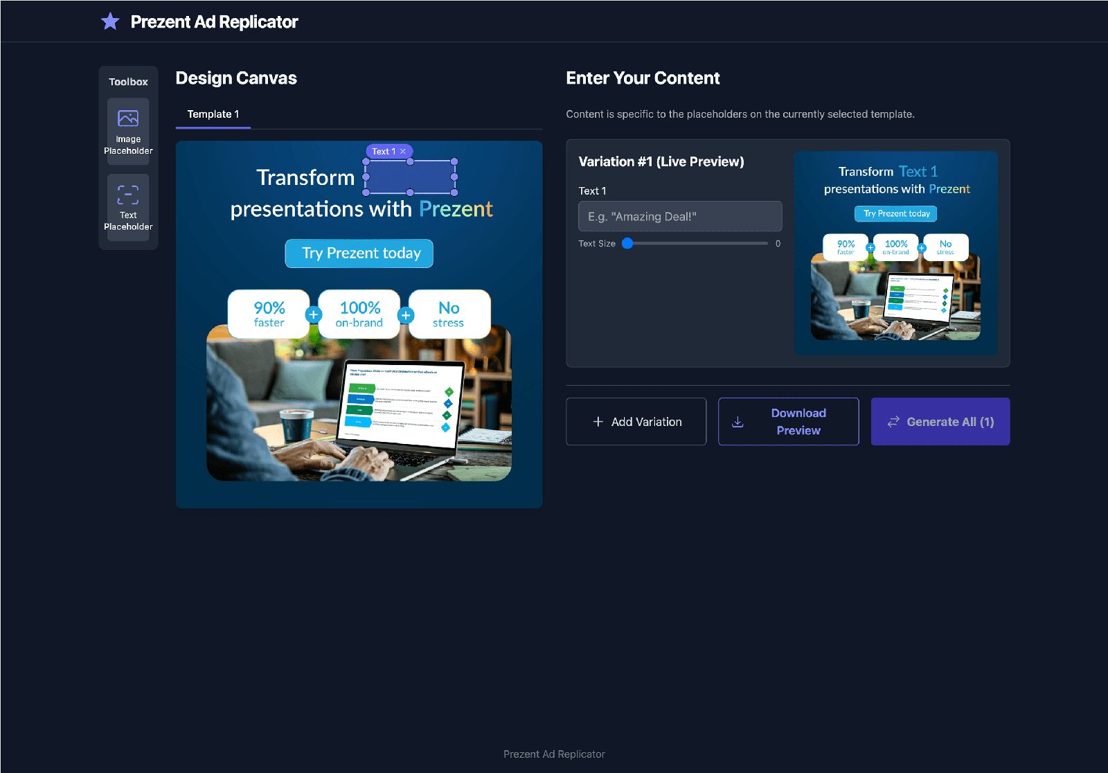
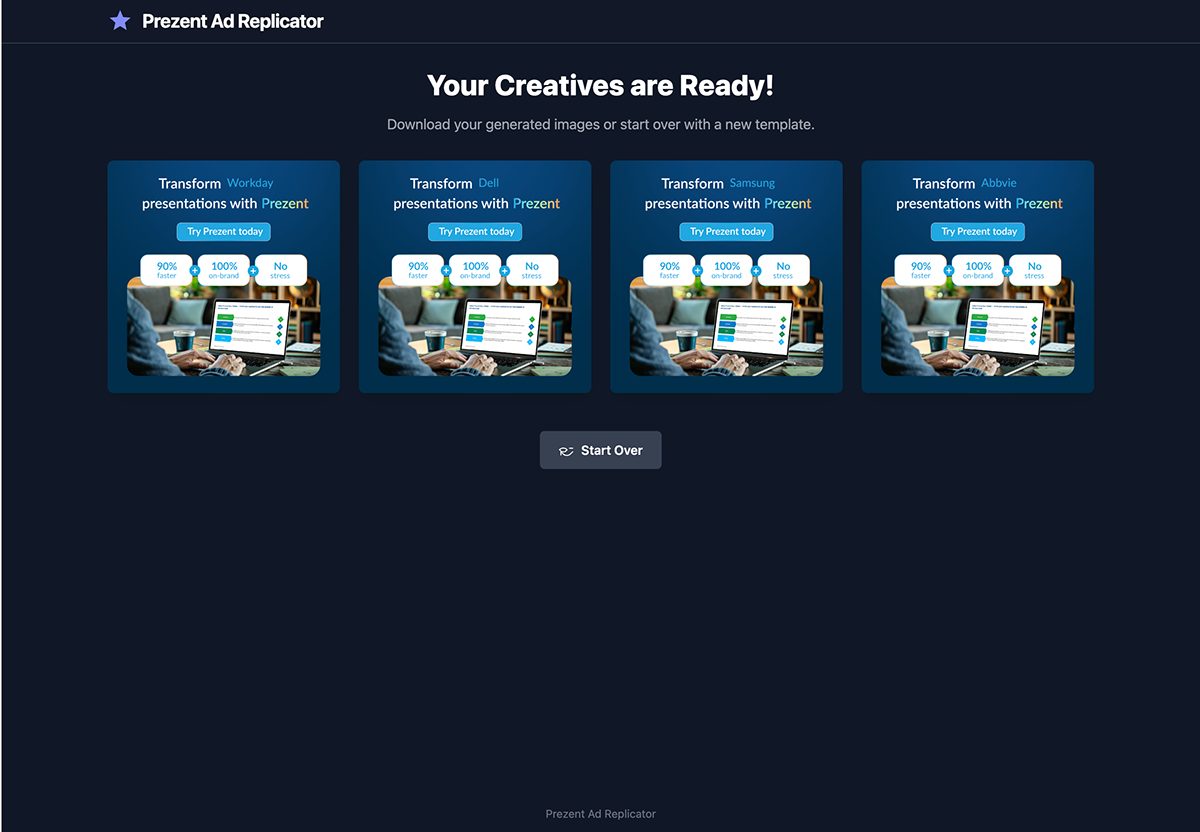
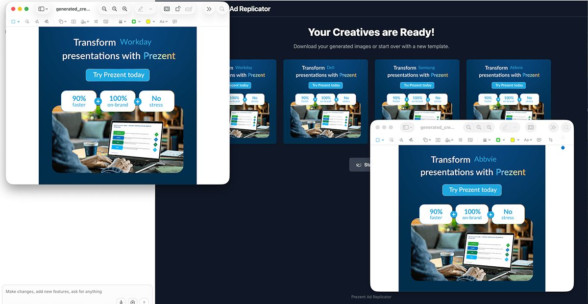
Brand systems fail at volume, and volume is exactly what a growth-stage company asks for. Rather than hire against the problem, I built tooling: an ad replicator where the guardrails live inside the master templates, so generating hundreds of variants cannot produce an off-brand one.

The Prezent Ad Replicator generating variations
Ad replicator · one template, every variation
Ad replicator, template setup
Ad replicator, design canvas
Ad replicator, batch variations
Ad replicator, generated output
5 700+
master templates in, finished ad variations out
90h 1h
designer-hours per batch. Three designers for a week became one designer for an hour
$139K
annual design labour returned. $140,400 down to $1,560

Worth saying plainly, because this is where these stories usually get dishonest: nobody lost a job and the quality bar did not move. The recovered time went back into direction and concept work, which is the only version of this that a creative team tolerates twice.

Branded document generation

The request design teams dread.

HR and Finance do not want a designer. They want a policy document, an offer letter, a board summary, and they want it to look like the company made it. Historically that request arrived as a favour, got deprioritised against revenue work, and came back three days later as a Word file nobody was proud of.

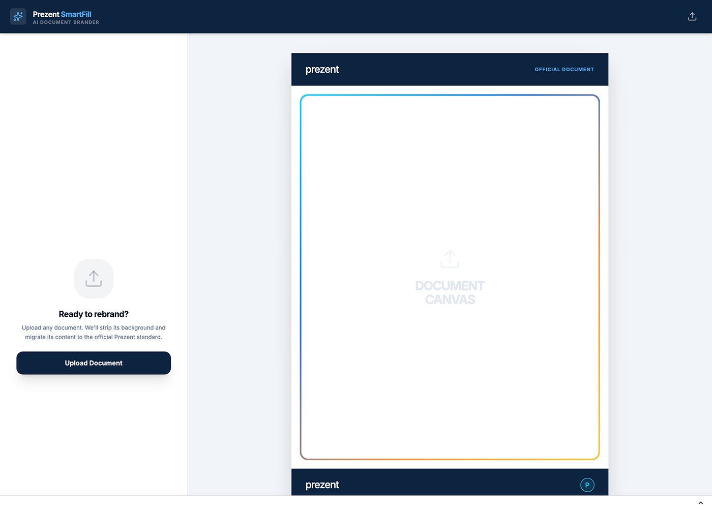
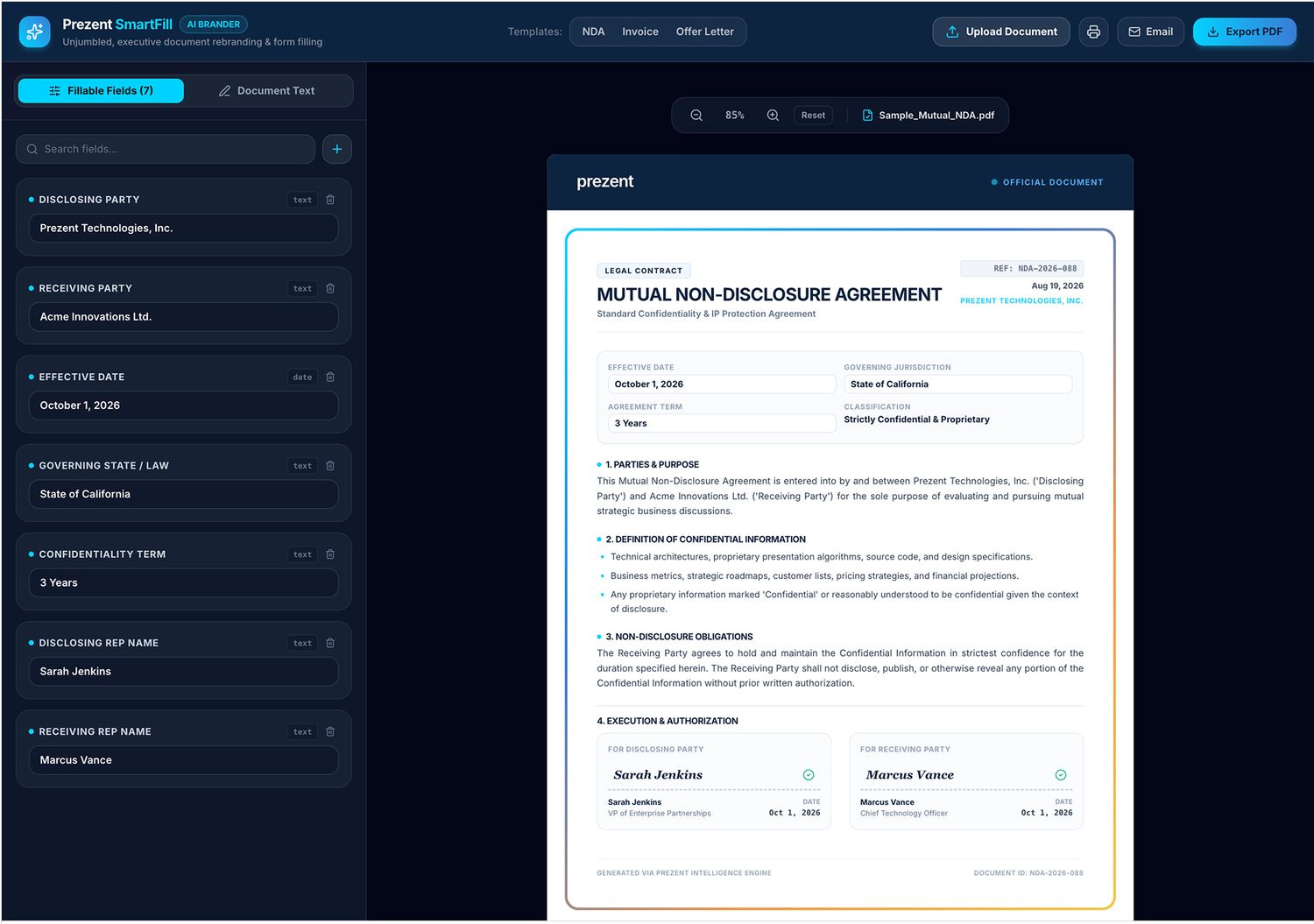
So I stopped treating it as design work and built them a generator. Brand rules live inside it: type scale, colour roles, spacing, logo placement, all fixed. They write the content, it produces the document. No ticket, no queue, no designer, and nothing off-brand leaving the building.

Branded document generator
Branded document generator output
Document generator · input and generated output
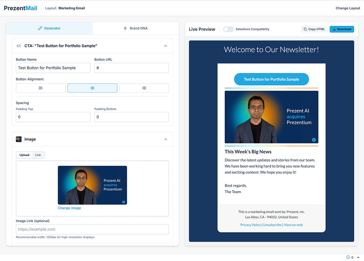
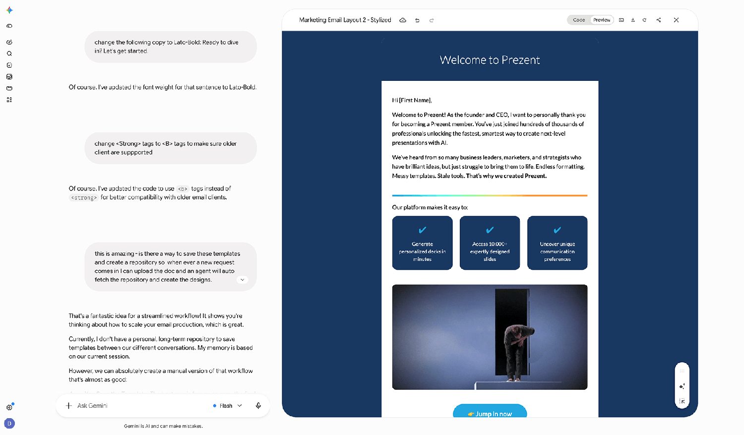
Marketing email generator

Email design time down 80%.

Campaign email is the highest-volume, lowest-judgment design work in a marketing team. Same modules, same rules, new words, every week. It is also where a brand quietly falls apart, because it is the work nobody senior is reviewing.

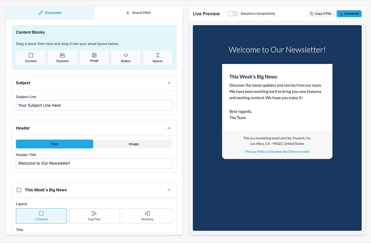
The generator assembles campaigns from approved modules, so the design decisions were made once and the weekly work became content. Roughly an 80% cut in design time per email, and the reviewer went from checking layout to checking the message.

Email generator interface
Email module system
Generated email output
Module system · assembly · output
Generative marketing

And then it stopped being an experiment.

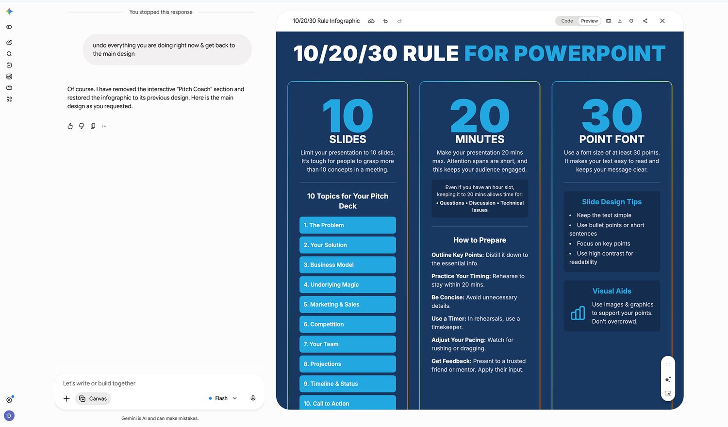
Once the tooling proved it could hold a brand standard, generative work moved into the ordinary queue. Flyers. One-pagers. Campaign imagery. Event collateral. Not the showpiece work and not the strategy, but the steady volume that used to consume a design team's week.

The rule that made it safe: generate components, never finished compositions. Type, logo, hierarchy and final composition stayed in human hands, where they were always going to end up.

Generative marketing output
Generative marketing · flyers, one-pagers and campaign imagery
Across the surface area

One system, every room.

Platform film
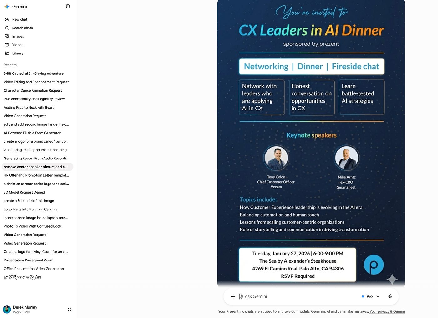
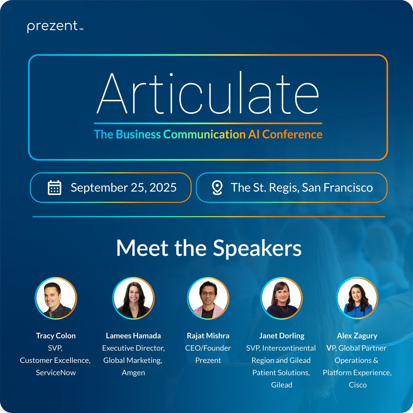
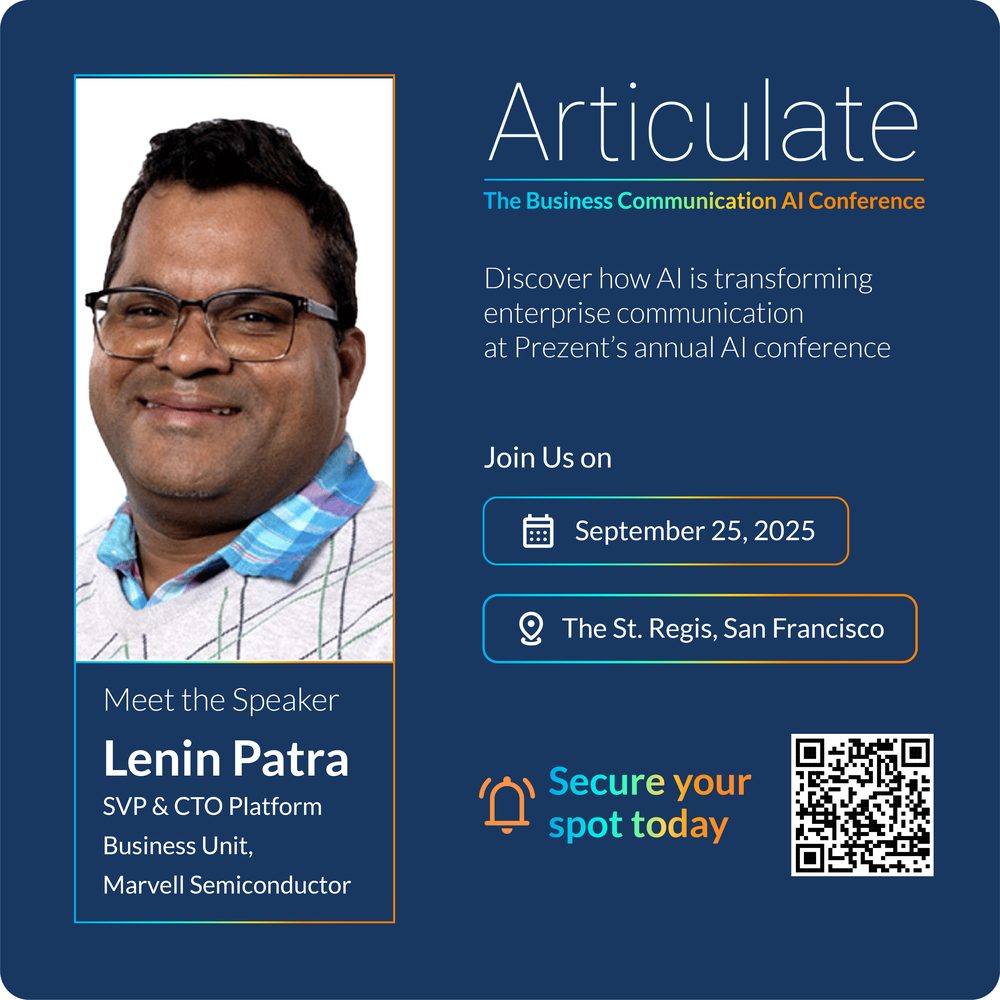
Articulate event
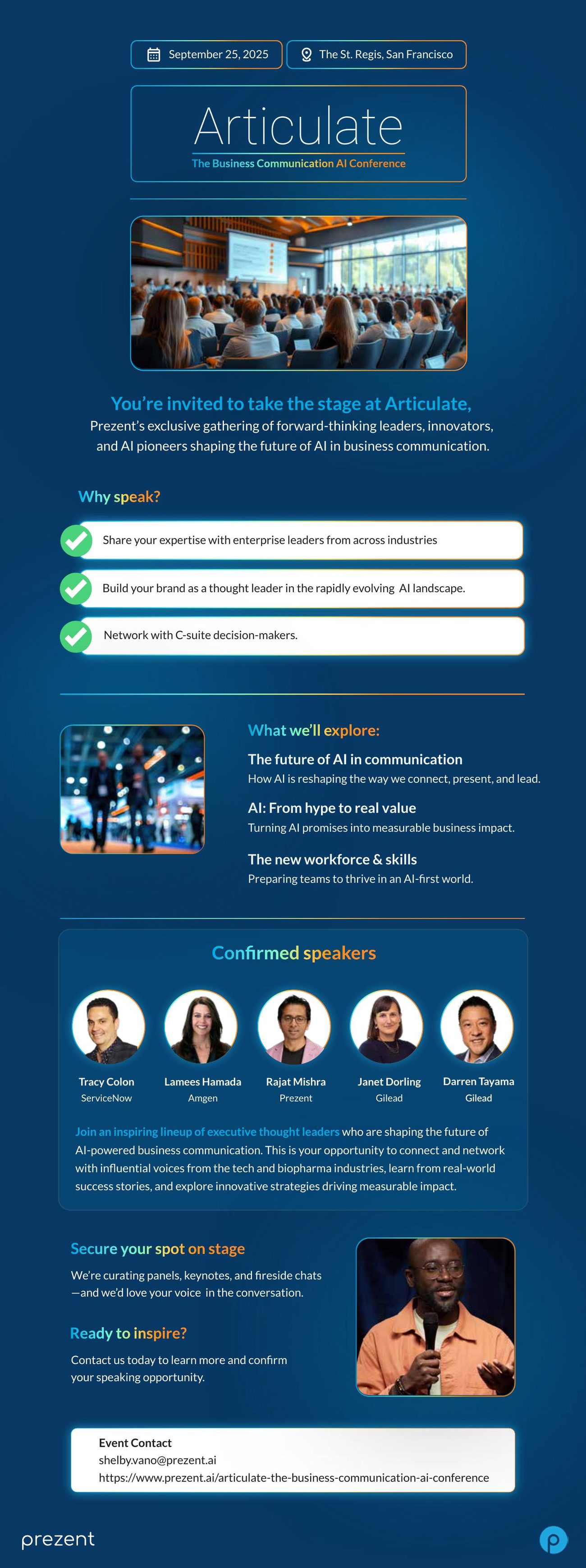
Articulate event
Articulate event
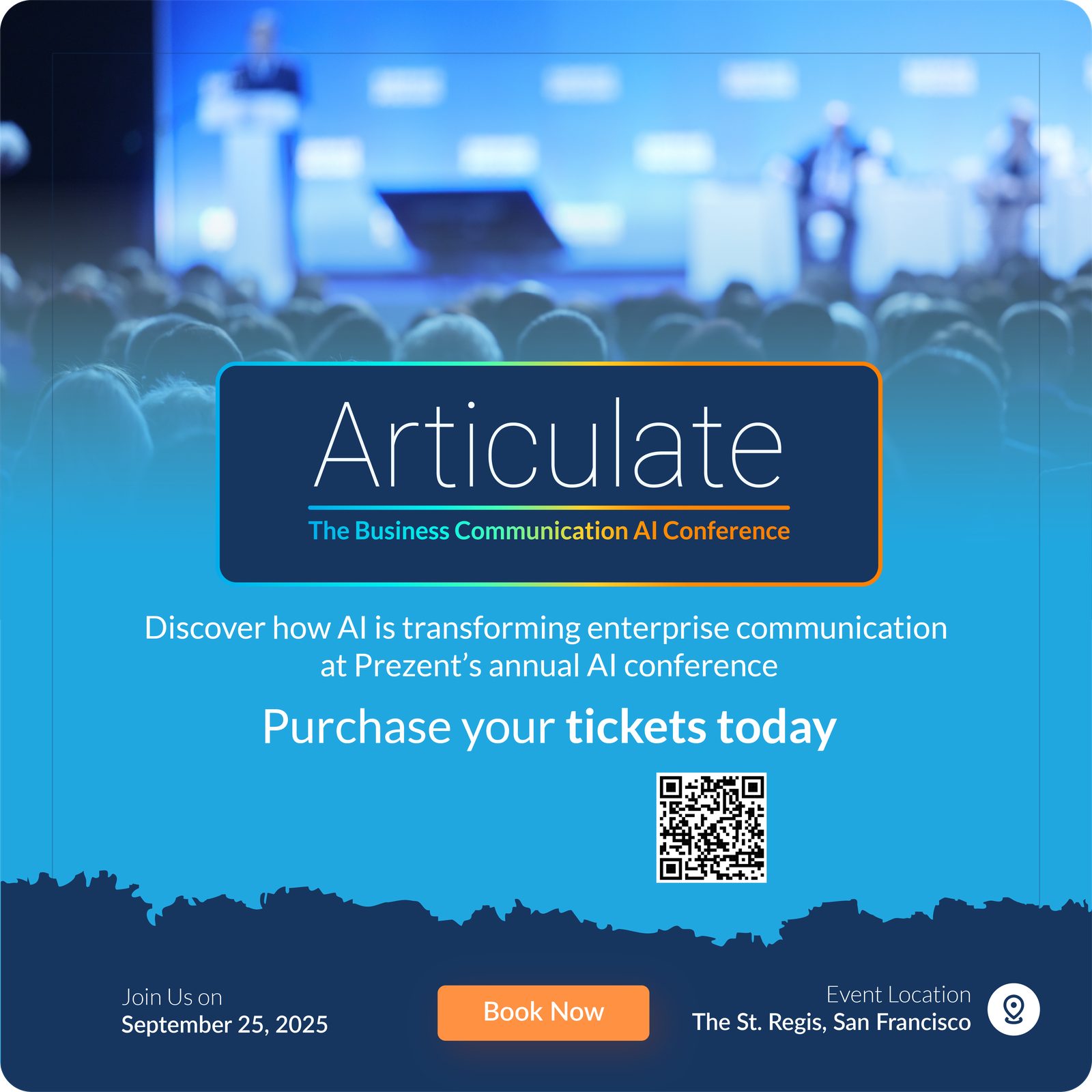
Articulate event identity
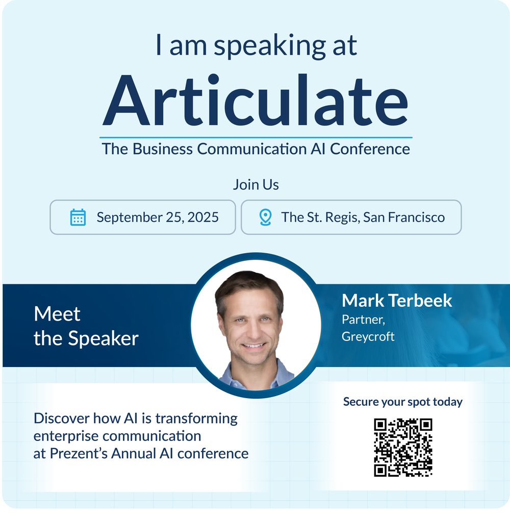
Articulate speaker invitation
Articulate speaker card
Astrid campaign
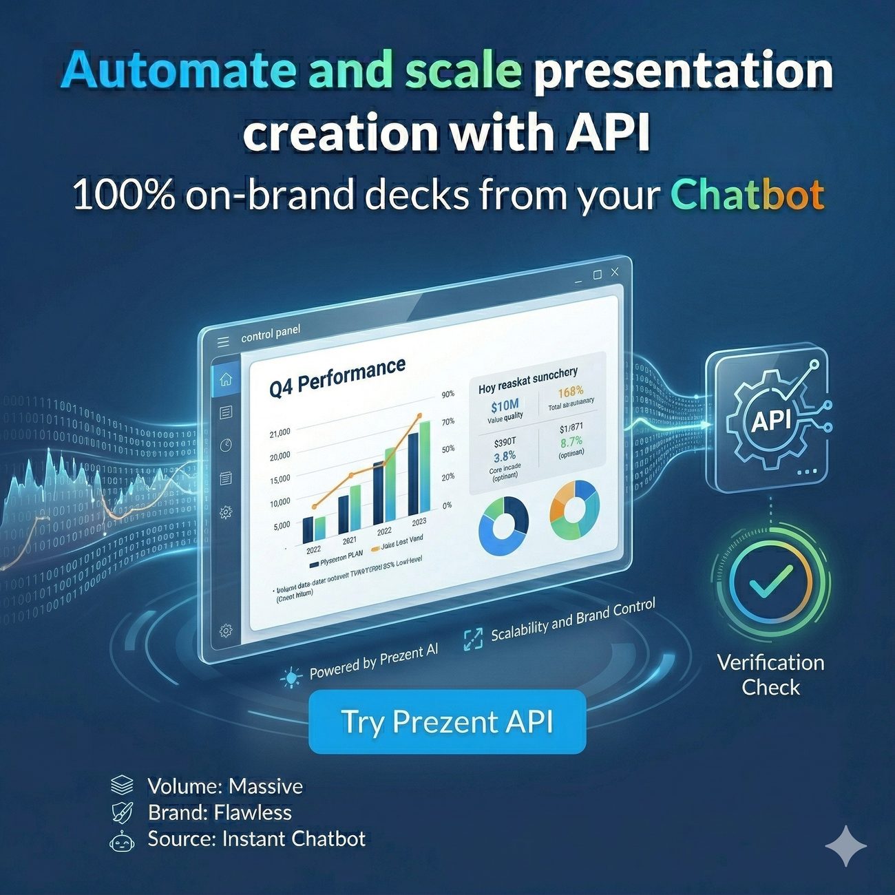
Campaign advertising
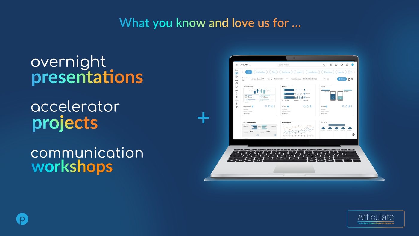
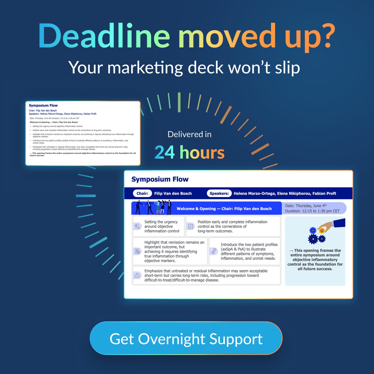
Overnight presentation campaign
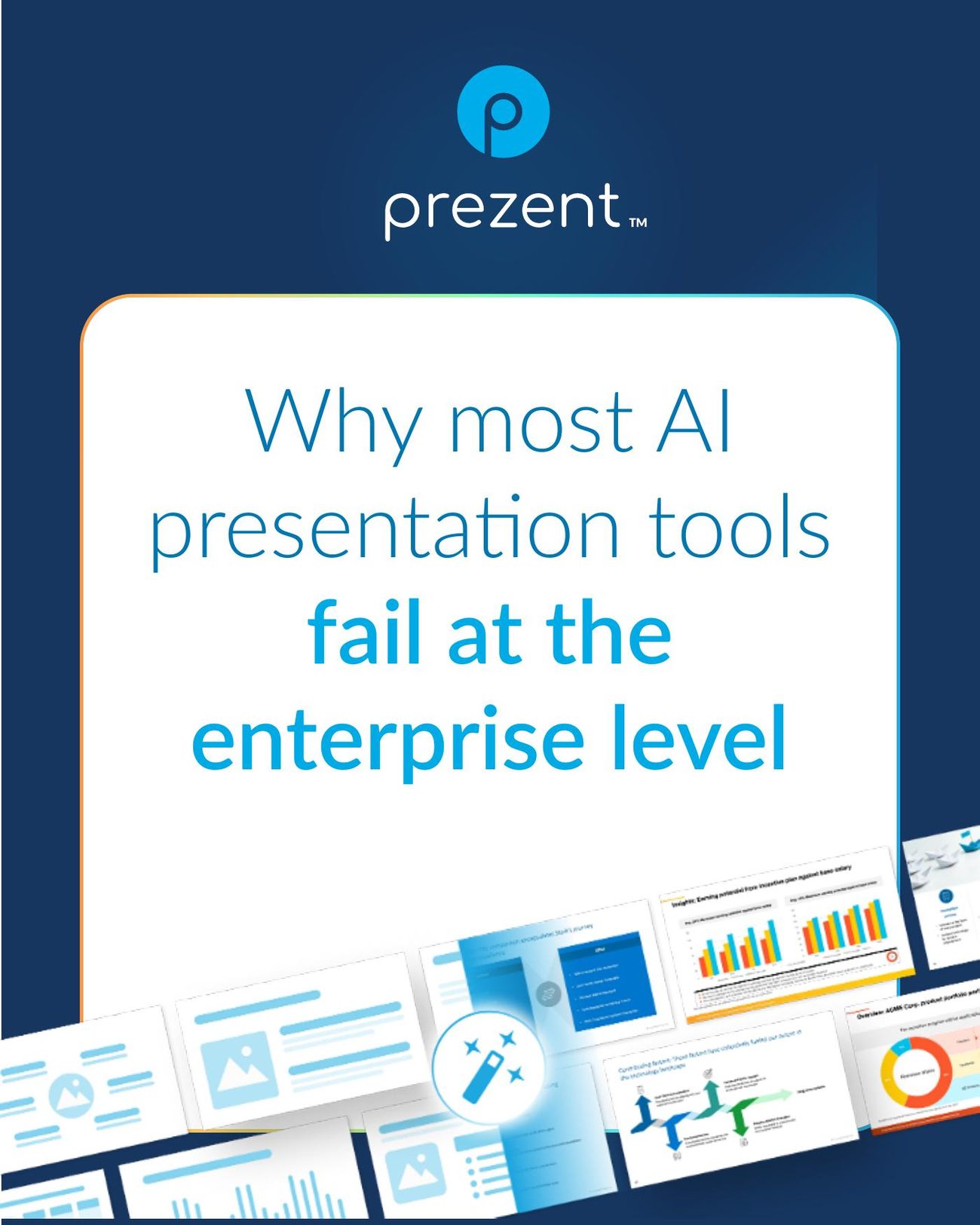
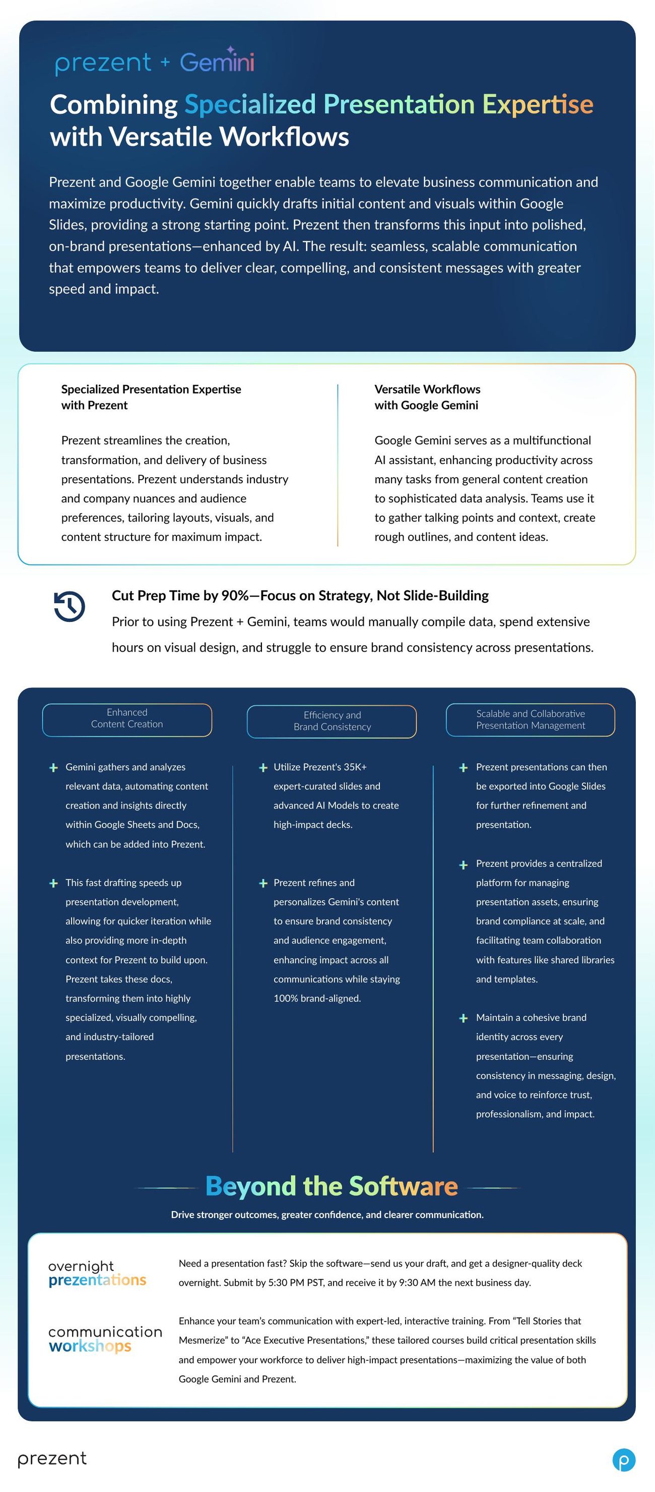
Gemini one sheet
Articulate event identity
Articulate speaker card
Event identity for Articulate · speaker system · campaign · one-sheets
What the system made possible

Speed nobody had to ask permission for.

1–3 days
turnaround on brand work, sustained, because the standard lived in the templates rather than in my head
1 team
grew the design function from one person to a full team across graphic, email, web, video and motion
2026
supported every funding round

A brand is not finished when it looks right. It is finished when other people can use it without you, and when the fastest way to do the job is also the correct way. That is the whole discipline, and it is why the tooling and the identity were never separate projects.

Govern with tools, not memos. Make the compliant path the fastest path.

Want this built for you?

Brand from zero, design systems that hold at volume, and AI production that returns hours to the people who should be thinking.